Thursday 28 April 2011
Friday 8 April 2011

This is a poster i created advertising my local newspaper. It gives all the key information such; where the peper can be bought, that it is available Monday to Saturday, the price and the adress of my website. The main focus of the poster is a landscape picture of the whole of the city of Portsmouth. This establishing shot works with masthead of the newspaper to instantly show people what the paper is all about and where it focuses on. It also features a phrase that is used a lot on the website, 'Working together for our community', this suggests that the paper is a very much a part of the community and brings together the paper and the reader.


The stories have now been written and are varied as one is as much a national as a local issue and the other atory only really has interest and appeal to people who live in the local area. This varies the newspaper and adds interest. The strip at the top has also been sompleted informing the reader about what else features in the issue; one of them being a chance for the reader to get involved with the paper and local community.

I now have the final layout for my front page, I have completed the second smaller story and seperated the two stories with a thin blue line and put them in seperate boxes. I have also added small finishing touches such as; who the picture was taken by in the corner of the photos, this makes the finished product seem much more proffesional.


I have now wrote the main story on the front page and one of the smaller stories. I have created a band on the main image that informs the reader on which page the story is continued and also written the same at the end of the smaller stoy.
I have also completed the left hand vertical strip on the front cover, i did this by inserting descriptions of the Tide Times and the Sailing Forecast, this was reasonably easy to do as it is just text but by using different fonts, styles, shapes and sizes still managed to make it look interesting. This is also very often seen in local newspapers.


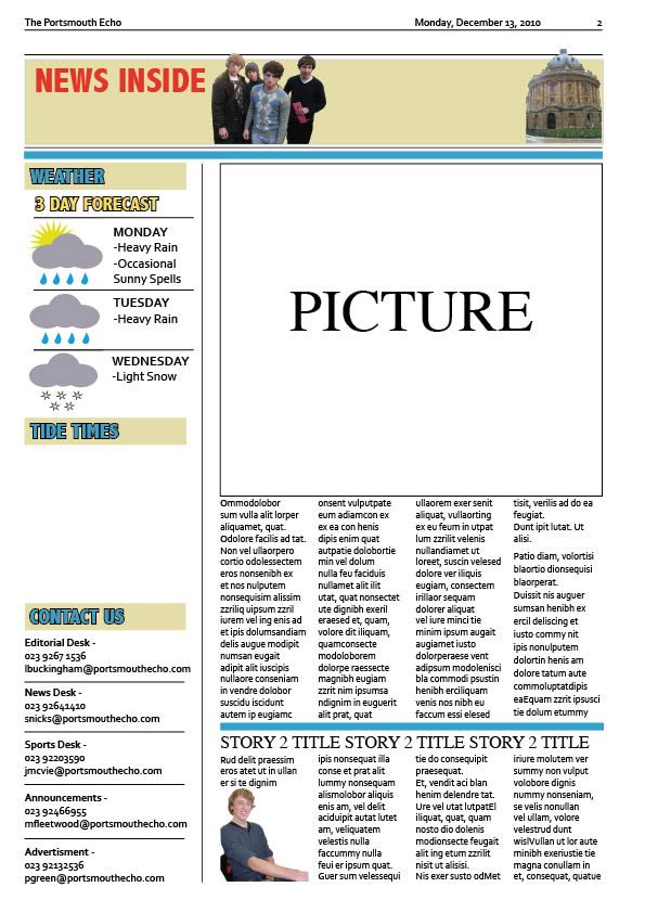
I have added another image to the front cover, for a smaller story and used the paceholder text tool again.
I have also added two more images to the second page. One in the top bar and also the main image of the story; I have also given this story a title that will instantly grab the attention of nearly every reader as it will most likely effect them.


I have chosen a title for the main story and one of the smaller stories ont he front page. For the main story the title works with the image to connect with the reader in an issue that is of a concern to people who live in the local area. I will now be able to write the stories to the title as well.


I have began creating a strip that uses pictures that people have taken to try and make the newspaper more personal to the people who read the local newspaper, as it gives them a chance to send in there own images. It is also at this point that I have began to think about colour schemes and how to keep a constant theme throughout the paper, I am creating variations of all the colours that I use to keep a similar colour scheme running througout the paper, I will also use these colours and this method when I create the website.

I have now completed the advert at the botttom of the page, I had to compromise as I could not acghieve the effect that i wanted. However, I think this works just as well, I created this effect by overlaying different coloured shapes and using strokes to outline the edges. I also used images of technological devices that I took in the classroom using a white piece of paper as a background so it could be easily cut out on photoshop. I have also made a logo using a photo I took of a rolled up piece of paper and appling a black and white stamp printing effect in photoshop.

I have began to try and make an advert at the bottom of the page, but through limitations of the program and skills, it became very diifcult to achieve the effect I wanted. I am using big bold tex (Story 1) to try and get an impression of what the title may look like once I have written the story. I have also now set up the margins around the page to that of the same of an example newspaper, (using The News as a template). This took a considerable amount of time as they are all different widths.


Now I have began to use some of the images which i have taken, while still experimenting with colours and layouts for the newspaper.
I have also used placeholder text, a tool on InDesign that allows you to fill a text box with text to give an example. This gives me an idea of what the cover will look like once I have the stories written. At the moment I am using three very large columns, but this is likely to change as this is not a convention of a local newspaper and makes the front cover difficult to read as it essay-like and looks unprofessional.


I began making my front page using a picture from the internet to give me a rough idea of the latyout that I wanted to use and to experiment with the InDesign program.
This is my very first draft and demonstrates the use of InDesign to create a masthead that will be a constant feature throughout the design of the local newspaper, the website for the newspaper and the newspaper poster.
It also gives a basic layout for images and text.
Subscribe to:
Posts (Atom)